How to Map Your District for Feminist Organizing — Quick Guide

Feeling lost in the maze of district lines? If the recent Supreme Court ruling left you wondering how to protect feminist wins, the first step is to see exactly where you stand — literally. This guide walks you through mapping your district so you can spot gerrymandering and launch a targeted campaign.
Why does mapping matter for feminist organizers?
District boundaries shape who gets elected, which directly impacts policies on reproductive rights, pay equity, and childcare. Knowing your map lets you connect the dots between a precinct's shape and the real‑world outcomes that affect women of color, LGBTQ+ folks, and working‑class families.
What you’ll need
- A computer with internet access
- Basic GIS curiosity (no prior experience required)
- Access to these free tools: Voting Info Project, Census Bureau Boundary Viewer, and optionally Ballotpedia
- A one‑page brief template (see our Mutual‑Aid Network guide)
Step‑by‑step solution
- Locate your precinct. Enter your address on the Voting Info Project’s Precinct Lookup. Note the district number and any sub‑district codes.
- Download the shapefile. From the same site, click “Download GIS data” for your state’s congressional map. If that’s missing, grab the Census Bureau’s boundary files and filter by your state.
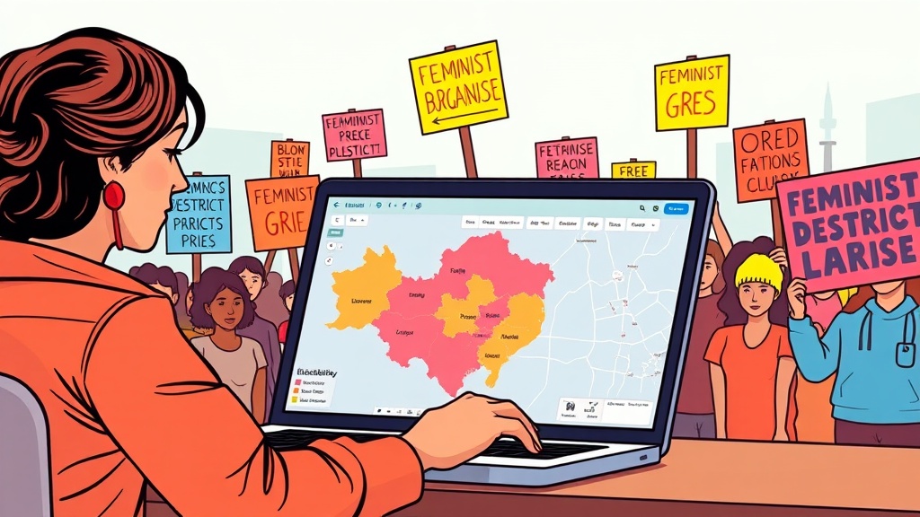
- Overlay demographic data. Open the shapefile in a free GIS viewer like QGIS. Add a layer from the American Community Survey to see racial, gender, and income breakdowns.
- Spot irregularities. Look for oddly shaped districts that split communities of interest (e.g., a predominantly Latina neighborhood cut into three districts). Take screenshots of any suspect slices.
- Draft a one‑page brief. Summarize the map, highlight the split, and explain why it hurts feminist policy goals — like funding for women’s health clinics. Use the template from our mutual‑aid guide to keep it punchy.
- Share with your coalition. Post the brief in your Slack, email list, or on the mutual‑aid platform list. Tag local elected officials and ask for a public response.
Pro tips
- Use color‑coding. In QGIS, color districts by the percentage of women of color residents. A visual cue makes the story compelling for journalists.
- Leverage existing data. The Brennan Center for Justice maintains a gerrymandering tracker with ready‑made maps you can cite.
- Automate updates. Set a Google Alert for “new district map” in your state. When a revision lands, repeat steps 1‑4 quickly.
Common mistakes (and how to avoid them)
- Skipping the demographic layer. Without community data you can’t prove the split harms feminist constituencies.
- Over‑complicating the brief. Keep it to one page; decision‑makers skim, not read essays.
- Ignoring state‑specific statutes. Some states already ban partisan gerrymandering. Reference those laws to add legal weight.
Takeaway
Mapping your district isn’t just a data exercise — it’s the foundation for a targeted, feminist‑focused power push. With a few free tools and a clear brief, you turn a confusing map into a rallying point for reproductive justice, pay equity, and climate action. Get the data, make the brief, and start mobilizing.
Steps
- 1
Locate your precinct
- 2
Download the shapefile
- 3
Overlay demographic data
- 4
Spot irregularities
- 5
Draft a one‑page brief
- 6
Share with your coalition